Top 3 Call-to-Action Best Practices
12-minute read
An effective call-to-action (CTA) can be the difference between a visitor turning into a potential client rather than just a browser that quickly loses attention.
You should have a call-to-action on all marketing channels, whether it’s on your social media, an ad, or your website.
In this post, we will focus on website CTAs. Your website is one of the only pieces of real estate on the web that completely belongs to your brand and you have full control of the outcome you want it to produce.
What is a call-to-action?
A CTA can take the shape of a button or a hyperlinked text that tells your visitors exactly what you want them to do.
The CTA is always accompanied by a piece of copy. The copy entices and persuades the visitor, and the CTA tells them the action they need to do.
Let’s look at an example:
This is a very simple example and one we encounter constantly as consumers.
Madewell has released their fall collection, and the main action they want visitors to take is to Shop New Arrivals.
This is no surprise as the main goal of an eCommerce website is to have visitors to click out of their homepage directly to a page where they can browse and shop.
This is why as you scroll through Madewell’s website, you will essentially be presented with multiple ways to shop either based on category or a new collection.
Different emotional and psychological cues are used to entice the visitor to take action and start shopping.
But there are some fundamental differences between service and product-based businesses and how they use the CTA buttons on their website.
Let's do a deep dive into best practices while keeping these two business models in mind.
#1 Eliminate Decision Fatigue
Having a well-designed homepage can be the difference between a visitor that converts and one that bounces.
Eliminating decision fatigue is one of the most important business rules, and it applies to how your website should be built. You got the visitor all the way to your website, now make it easy for them to stay and give you their business.
The most important part of learning how to write and create a compelling CTA is to focus on everything around it.
Let’s take a look at a CTA that removes all decision fatigue:
✅ Inspirational header
✅ Easy sign-up process
✅ Tells the visitor everything they need to know in case there’s any hesitation. The visitor knows it’s free, and they don’t need to enter a credit card.
Another point of friction is also eliminated by stating that this process automatically opts them into their mailing list.
#2 Stay Consistent
Have you ever tried to use a friend’s phone that was different from yours?
Although a lot of phones are built in the same way, a new phone can feel completely foreign, right? You’ll get used to it at some point but it can take some time.
The same logic applies to your brand and more specifically to the colours and shapes of your CTAs.
At Saffron Ink Studio, our main call-to-action is ‘HIRE THE STUDIO’. We put it in the same shape and colour everywhere on the website in order to create familiarity for your eyes.
This CTA is scattered throughout the website and by the second or third time you see it, you already know what it says without fully paying attention to it.
There are two types of buttons you should become familiar with:
Primary button — It has a colour that pops and the filled-in background makes it stand out among the copy surrounding it.
Secondary button — We know it’s a button due to the outline, however, it does not power over the primary button.
You can use these two types of buttons to seek a different call-to-action from different audiences. We will look at some examples later.
#3 Focus On Placement
In this section, we will mainly focus on the placement of CTA buttons on the homepage. The way the homepage should be treated differs between service and product-based businesses.
A service-based business wants to encourage the visitor to scroll, learn about the services, and provide their information so they can be contacted.
A product-based business wants to get the visitors off the homepage and get them to start shopping.
Here are some ✨golden✨ rules you can follow.
Service-based businesses
RULE #1
Include a strong call-to-action button on the top right corner of the screen. Our eyes scan the website in a Z pattern, and that corner is one of the most important pieces of real estate on your website.
RULE #2
Add 1 to 2 call-to-action buttons on your hero banner. This is where design becomes very important. You can use this to cater to two different audiences.
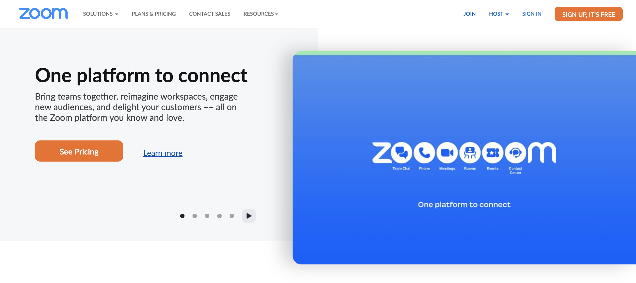
Zoom is using two primary and one secondary CTA button geared towards new leads. Existing customers will most likely interact with the app or they have a small sign-in link at the top right.
The ‘SIGN UP, IT’S FREE’ call-to-action is geared towards a hot lead, most likely someone that knows of Slack, or has visited the website before.
The ‘SEE PRICING’ call-to-action is for a warm lead that most likely has some information about the product but needs that little push before making a decision.
The ‘LEARN MORE’ call-to-action is geared toward a cold lead, someone that needs more information before they make a decision.
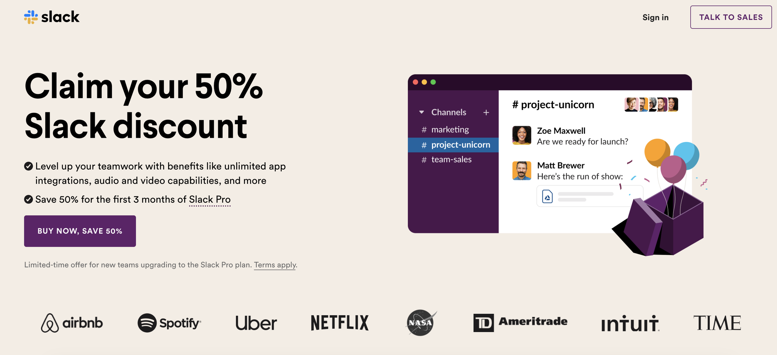
Slack cuts to the chase, they are telling you in the header and the primary button exactly what you should be doing.
The first thing that stands out is the ‘BUY NOW, SAVE 50%’ CTA button, and the top right button blends in more because they want to you go ahead and buy but if you’re not quite ready they are still available for a chat.
In this case, Slack can be bold given their brand awareness and the fact that they are minimizing the risk of committing to their product by 50%.
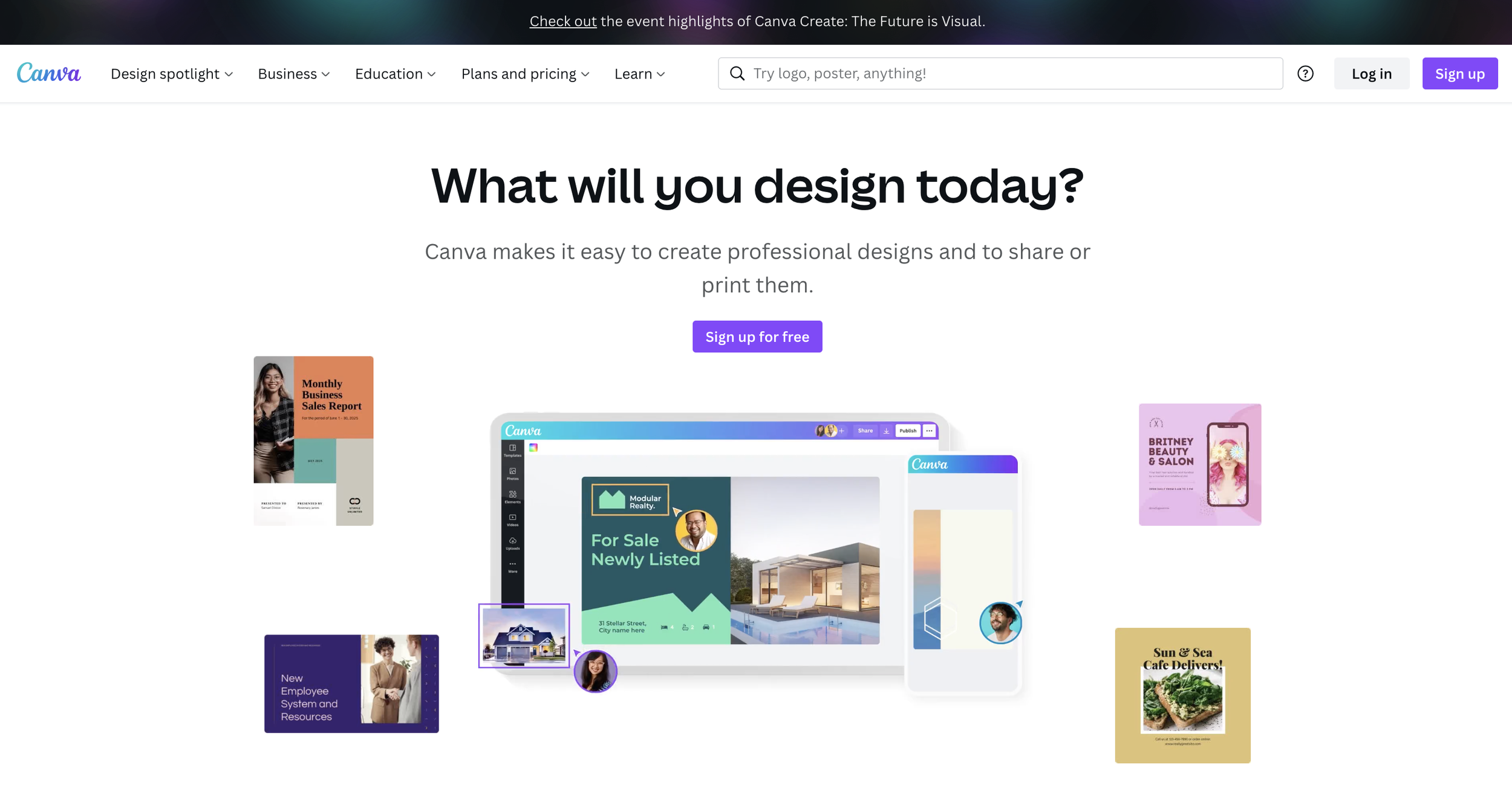
Canva is very direct and uses two primary CTA buttons that follow the golden rule. They are so confident in their product and their free offering that they just want you to sign up and see it for yourself.
Which CTA should you use?
There are two ways you can go about CTAs on a service page. In both cases, you are gathering information to be able to contact the client, however, the follow-up will be different.
01 Invite them to speak with your team
You can set the expectation that the lead will receive a no-strings-attached demo or a quick chat with a sales team member.
There are different variations of these CTAs you can use, you can create a sense of urgency by adding the word ‘now’ or you can add the word ‘free’ to ensure that it is a no-strings-attached call.
Getting a commitment to watch a demo or speak to your sales team shows a different level of purchase readiness than filling out a lead form.
02 Invite them to fill out the lead form
This can be done in many ways either through an inquiry form, which is usually a lead qualification for strategic questions, or you do a valuable exchange where you offer your audience a trial, white page, a webinar, or any piece of educational content in exchange for their email.
Product-based businesses
RULE #1
The top right corner is still important real estate for product-based businesses but it mainly exposes tools for shoppers, such as a search bar, cart, and login option.
NOTE: the search bar is an extremely important aspect of an eCommerce website that we will deep dive into in another post.
RULE #2
The same second rule applies — Add 1 to 2 call-to-action buttons on your hero banner.
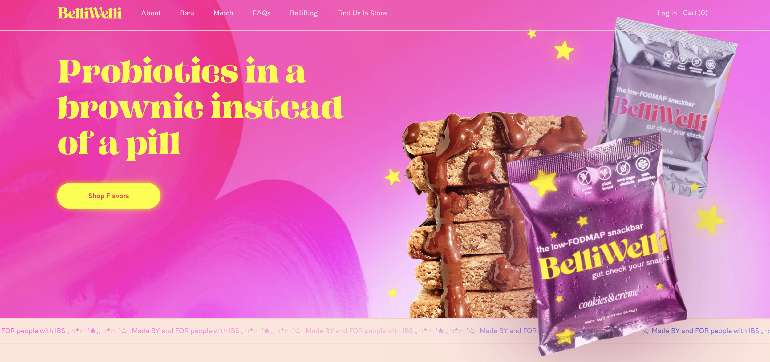
BelliWelli does a fantastic job on their hero banner, the header tells you exactly what the product is, and they are using a primary button for their CTA with product-specific copy that tells you to start shopping now and that there are multiple flavours waiting for you on the other side of the click.
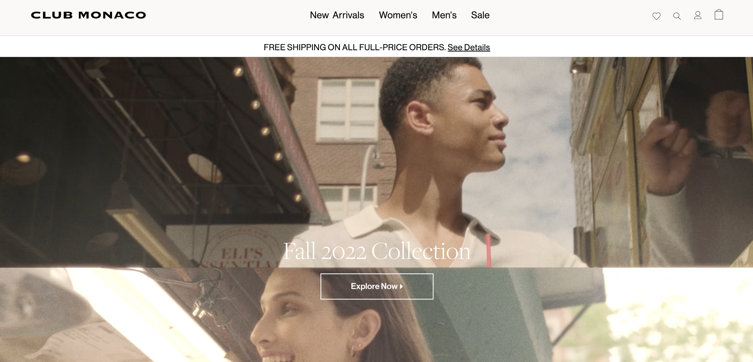
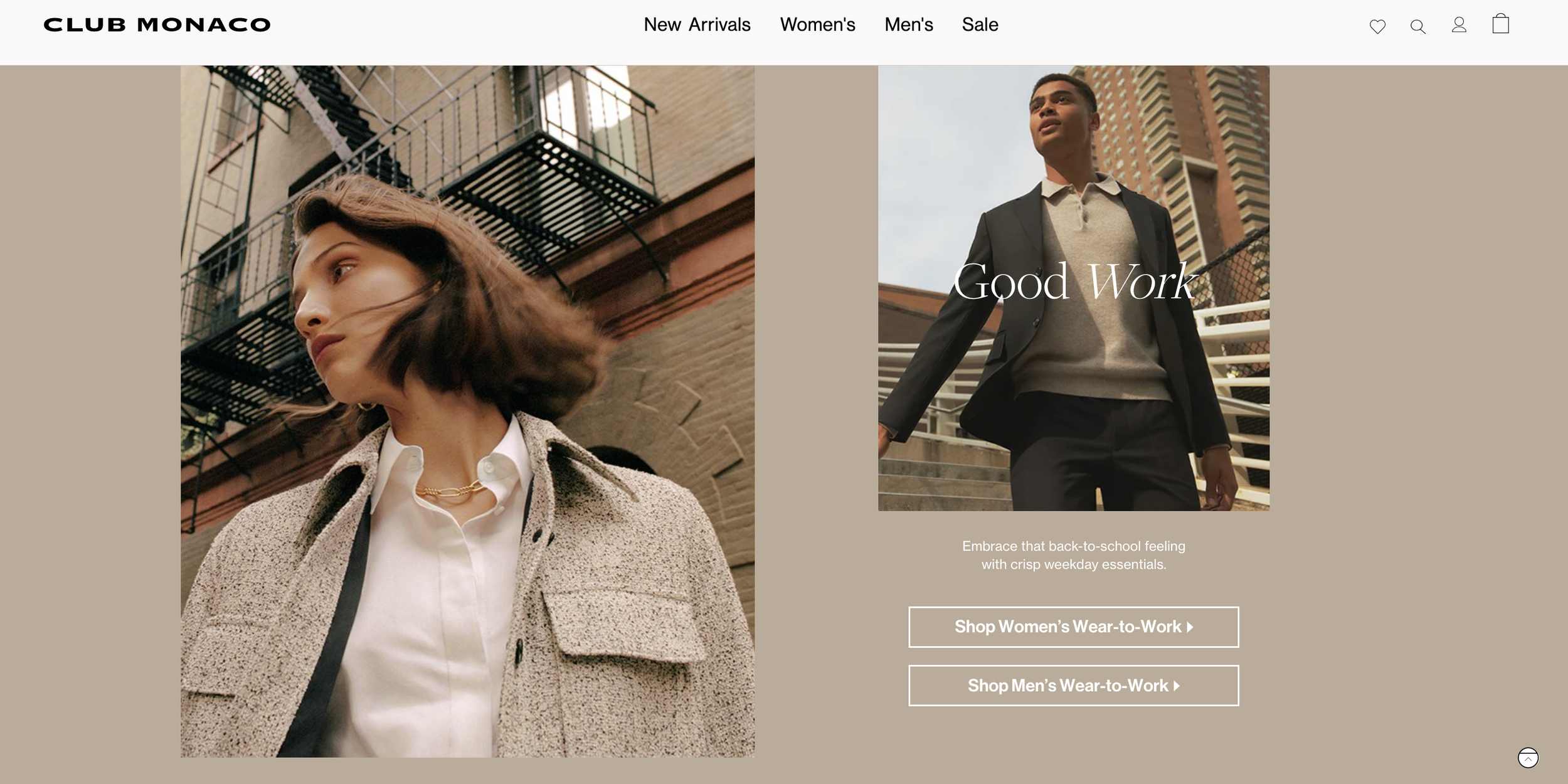
Club Monaco has a more subtle tone to their website, they are using a secondary button for their CTA on the website. The CTAs are very clear, they want you to start shopping and here you can see examples of this scattered throughout the website, they want you to click out and browse their collections.
Avoid These CTAs 🚫
You don’t need to entirely avoid these CTAs on the homepage, but they are not strong enough to be your primary CTA.
Learn More
Contact Us
Explore
More Than 20 Call-To-Action Ideas You Can’t Resist
#1 Shop Now
#2 Buy Now
#3 Compare Features
#4 Start Saving Now
#5 Book Demo
#6 Sign Up
#7 Talk to Sales
#8 Download Trial
#9 Contact Sales
#10 Book Meeting
#11 Work With Us
#12 Work Together
#13 Get A Quote
#14 I’m In!
#15 Sign Up for Free
#16 Join Us
#17 Get Started
#18 Get Started for Free
#19 Get the Guide/Report
#20 Free Webinar
#21 Download Now
#22 Register Now
#23 Get It Now
#24 Start Saving Now
An effective call-to-action requires strategic planning, persuasive copy, and a deep understanding of the customer journey.


