Close-up of a green rectangular sticker sheet with the word 'saffron' in white lowercase letters, featuring a white circular and curved design, and a small white logo at the bottom.

Strategy-first.
Detail-obsessed.
Easy to work with.

We’re not big. We’re not bloated. We’re just the team you call when you’re serious about building something great, and you want partners who think like you do.

Clear strategy, clean design, thoughtful execution. That’s the work. And we love the work.

#2E6B48

#071C15

#8C32CD

#EF7961

#FFD8B8

#41906C

#CF69FF

Logotype

The logo is the brand’s identifier, used in all applications.
A green abstract shape resembling a stylized butterfly or flower with the word 'Pictogram' written below.
Illustration of the word 'Saffron ink' in large green and black text, with the word 'Typography' beneath it.
A graphic design with green vertical stripes and overlapping black circles with various sizes. The word 'ink' is written inside a green circle on the right side.

Logostructure

The logo represents the thinking and values at the core of our brand.
A black background with the word 'Saffron' written in large white letters and the word 'ink' in smaller letters inside a circle

The idea and intention

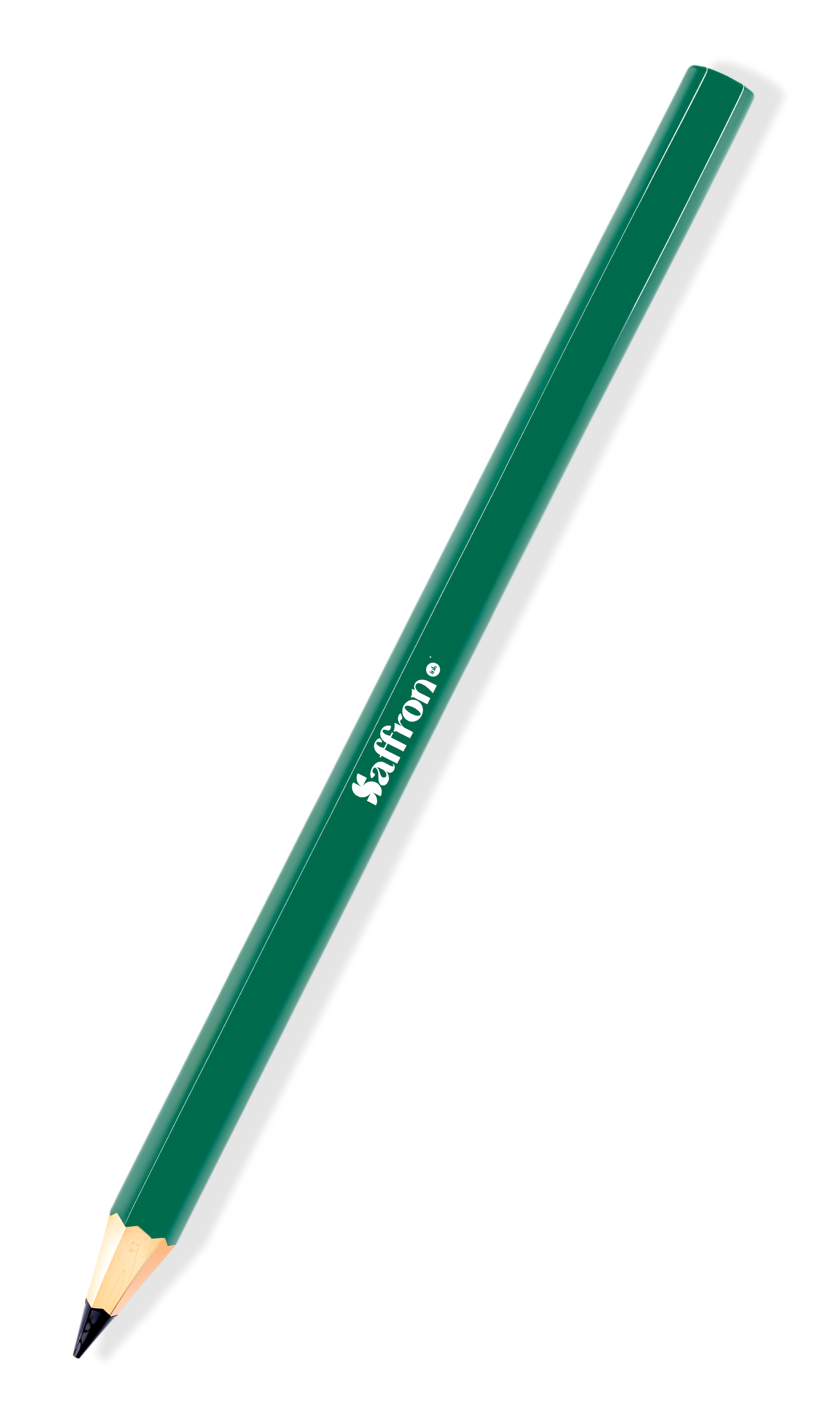
A green mechanical pencil with a black eraser tip and white text that says 'safron' on the side.

Mountain
Sophisticated
Human-centric

Blend

S for Saffron — rare, intentional and always crafted with care.

Green abstract geometric shape
Green arrow pointed to the right on a black background.
Close-up of a large, black and green dollar sign symbol.
Dark green angled arrow pointing right.
Abstract green geometric shape with curved and straight lines

Saffron

Inspired by the most valued spice in the world, not for its flash, but for its depth, care, and rarity. It reflects the way we work: considered, crafted, and rooted in something real.

Black and white right-pointing arrow symbol

Ink

Speaks to our copy-led approach, from brand messaging to content, and the belief that how you say something is just as important as what you say.

White arrow pointing to the right.
Bold black and white graphic with the word 'Saffron' in large text and 'ink' in smaller text inside a circle.

Together, Saffron Ink speaks to our balance of strategy and creativity, where every detail has a reason, and every move has meaning.

The word 'Saffron' written in bold black font on a purple background with a small black circle containing the word 'ink' next to it.
A black background with a stylized, beige circular logo in the center, consisting of four curved shapes forming a symmetrical pattern.
A graphic with an orange background featuring the word "saffron" in large white letters, with a small white circle containing the word "ink" next to it.
Green background with white text that says 'saffron' in bold font and 'ink' in smaller font inside a circle.
A green square background with a stylized white 'S' logo in the center.
A minimalist black logo resembling a stylized letter 'S' on a light peach background.
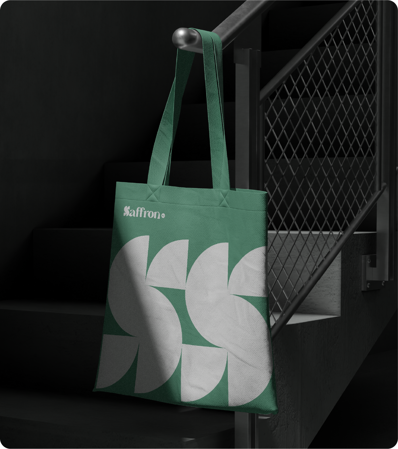
A green tote bag with white abstract design and the word 'Saffron' written on it, hanging on a staircase railing in a dark room.
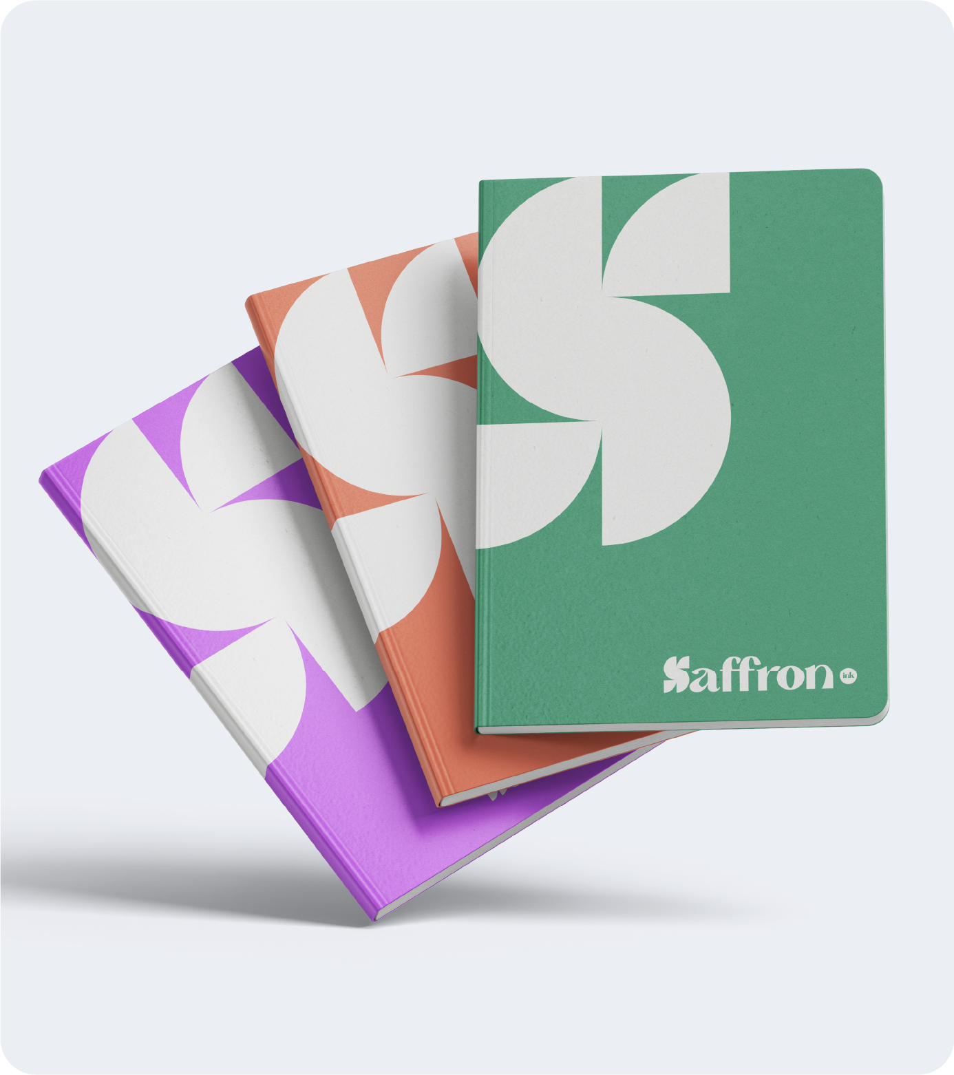
Three notebooks with colorful covers, arranged in a fan, with the top one green and labeled "Saffron".
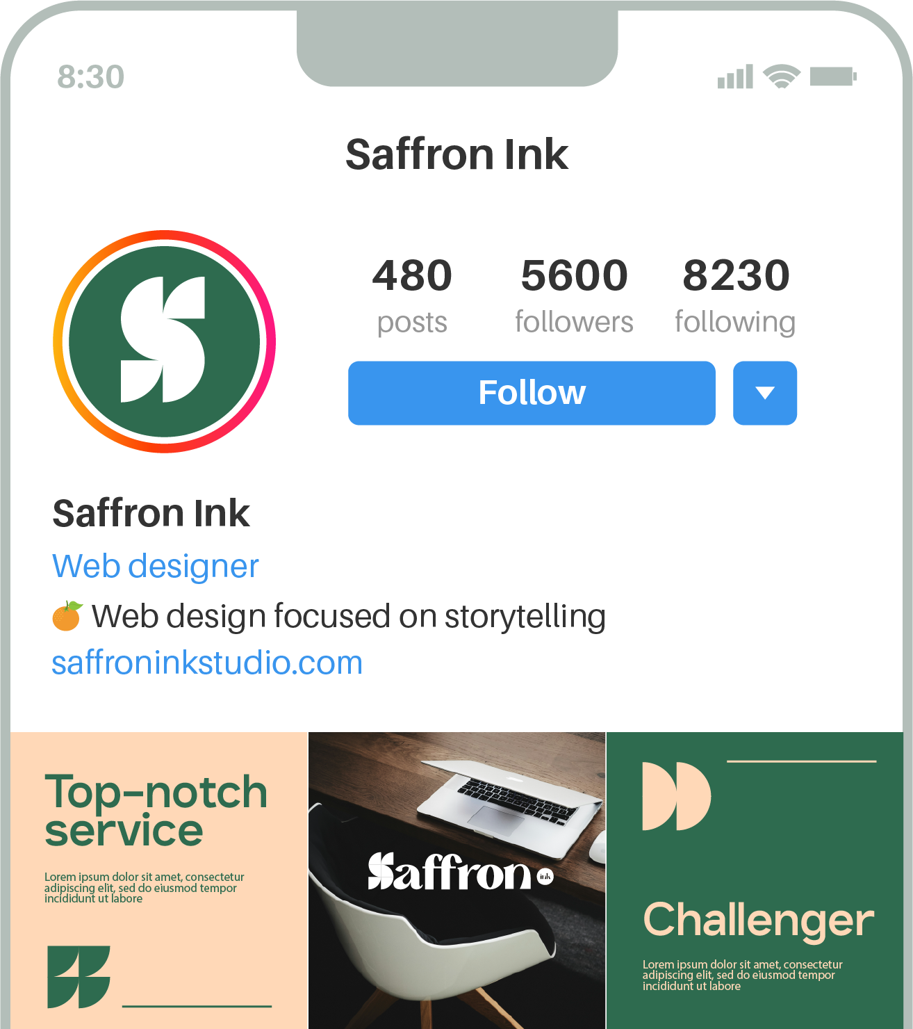
A graphic design featuring a laptop on a desk with the word 'Saffron' beneath it, with promotional text that reads 'Top-notch service' and some placeholder lorem ipsum text, set against a split-green and beige background with stylized quote icons.

Principles in Practice

User

A simplistic green icon of a person with a circle for a head and a semi-oval for the body.

We start with people. Every decision, from strategy to design, is rooted in how real users think, feel, and act

Mountain

Close-up of a black and green abstract design.

We help you climb with clarity. Whether you’re launching or leveling up, our process breaks the complex into something doable.

Detail

Green circular object with a small diamond-shaped hole in the center.

We obsess over the little things, because they become the big things. From microcopy to motion, the difference is in the details.

Challenger

Close-up of a green Pac-Man character from the arcade game.

We’re not here to nod and smile. We ask questions, challenge assumptions, and push your brand toward its strongest expression.

Design

A stylized, symmetrical green leaf or plant icon with three main sections.

Design isn’t decoration. It’s structure, feeling, language, and meaning, and we build it to last across every surface of your brand.

Momentum

Close-up of a dark green coin with partial cutouts showing a reflective surface.

Our work is built to move. Not just look good in a deck but create real, sustained momentum for your brand, team, and audience.

Community

A geometric design with four green quarter circles arranged in a symmetrical pattern.

We believe great brands aren’t just seen, they’re felt. The best ones make people feel included, connected, and part of something.

This is how we build our own brand,

with care, clarity, and a whole lot of thinking.

Imagine what we’d do with yours.